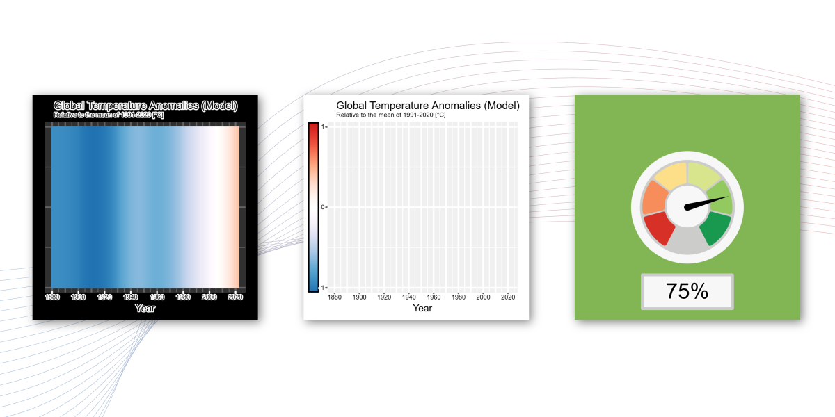
How has global temperature anomaly changed over time? Explore the visualizations below and look for patterns in how the anomaly changes from year to year. Move the slider to see how the global anomaly map and warming stripes change together.
You have explored how global temperature anomaly has changed over time. Now, use what you noticed to construct a graph that models this relationship.
Graph the Model
Use the warming stripes in Visualization 3 to construct a graph modeling global temperature anomaly over time.
Note: Visualizations 2 and 3 both show warming stripes, but they represent different things. The warming stripes in Visualization 2 represent the observed global temperature anomaly over the years, whereas those in Visualization 3 represent a model of the global temperature anomaly over the same period.
You have constructed a graph modeling global temperature anomaly over time. Now, let's see how well your model represents the data.
Evaluate Your Model
How well does your graph model global temperature anomaly over time? Use the feedback to decide whether your graph needs revision.