Imagine asking a group of children, “What makes you well liked by your classmates?” Would they say that good grades, sports, attractive appearance, or having lots of money are most important? Would girls and boys give different answers? Questions like these were investigated by a group of researchers at Michigan State University in the United States. Part of their data is shown in Figure 1.
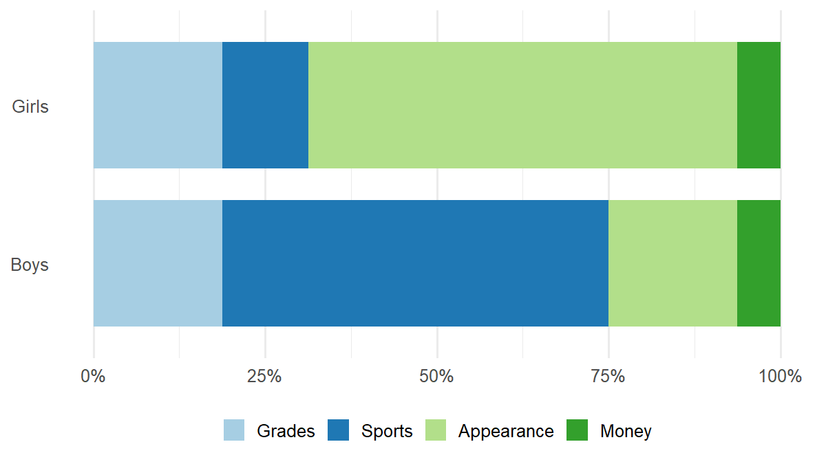
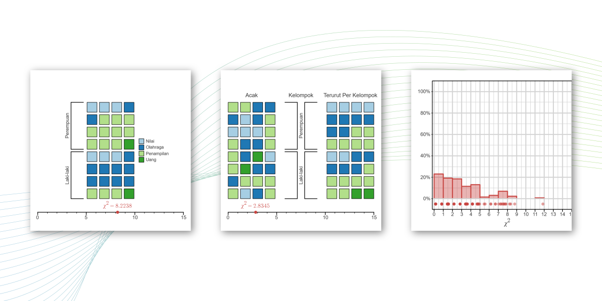
The data shown in Figure 1 are represented more clearly in Visualization 1. In this visualization, each child is represented by a square, and the color of the square indicates that child’s preference. The 16 squares in the top row represent the preferences of girls, while the 16 squares in the bottom row represent the preferences of boys.
Take another look at Figure 1. Do the differences shown in the data suggest a relationship between gender and children’s preferences? Or could these differences have arisen by chance alone? In this interactive simulation, you will explore how the chi-squared test helps answer this question.
Could the Differences Be Due to Chance?
Let’s imagine that gender has no influence on children’s preferences. If that were true, what might the data look like? Click “Shuffle” to find out!
The results of each shuffle in Visualization 2 are also summarized in Table 1. The corresponding χ² statistics from repeated shuffles are displayed in Visualization 3.
| Gender | Grades | Sports | Appearance | Money |
|---|---|---|---|---|
| Girls | ||||
| Boys |
Note: In both Visualization 1 and Visualization 2, you’ve seen the chi-squared statistic (χ²). Put simply, this statistic measures how different the observed pattern in the data is from the pattern we would expect if there were no relationship between the two variables.
Now examine the distribution of χ² values in Visualization 3. Remember that these χ² values were generated under the assumption that gender has no influence on children’s preferences.
Based on Visualization 3, do you think the difference in preference patterns between girls and boys shown in Figure 1 and Visualization 1 (χ² ≈ 8.2238) could be explained by chance alone? Or is there a more reasonable conclusion?